|
Using Our Charts and Tables
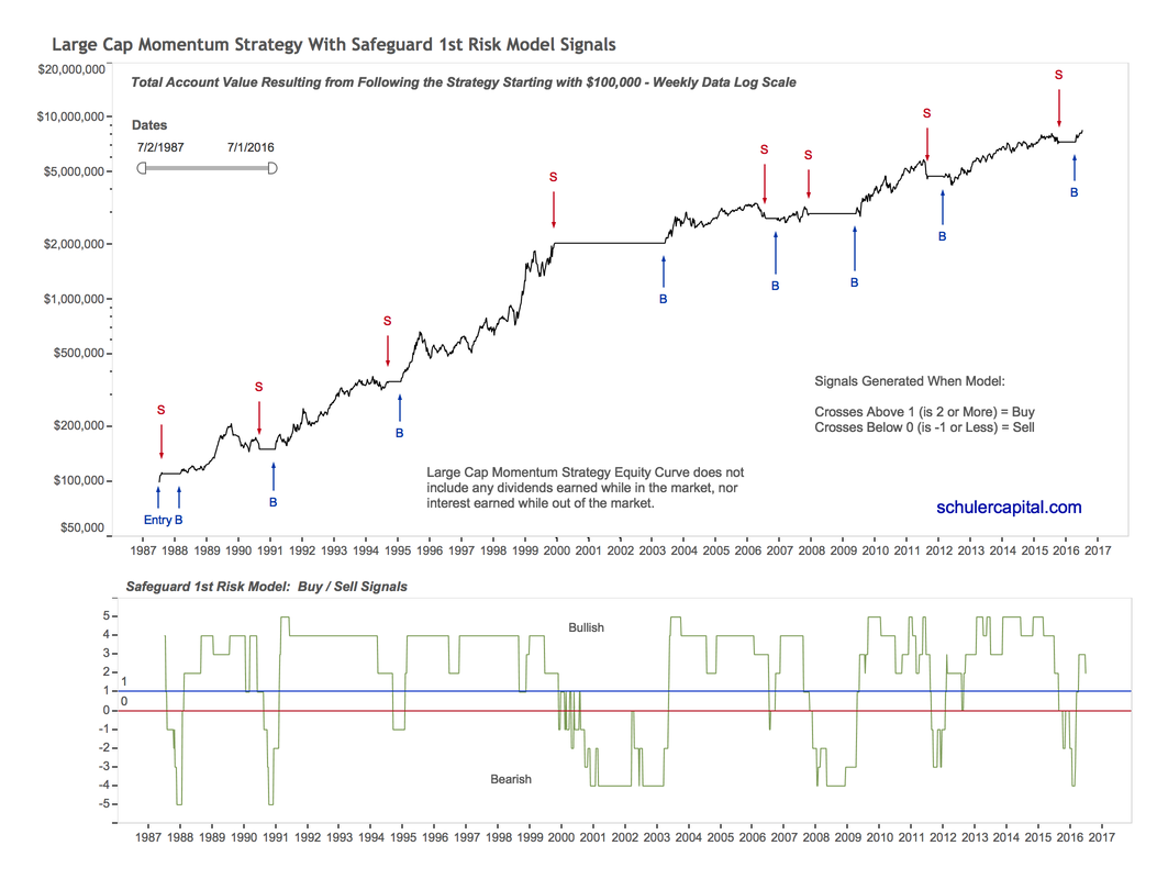
In this section, we are going to introduce you to our performance charts and tables. . We use the same basic charts and tables to evaluate our Indicators, our Safeguard 1st Risk Model and all of our Strategies, but for our example we chose the Large Cap Momentum Strategy. Signal Chart
The top half is a chart of the Total Account Value over time if an investor had invested 100% of his/her account in the Large Cap Momentum Strategy. In the bottom half of the chart, the green line is the sum of the scores of our seven indicators added together, which is the final result for our Safeguard 1st Risk Model. The horizontal lines are thresholds that generate buy and sell signals when the green line crosses above or below them. You can see the buy and sell signal arrows in the top half of the chart. |
|
|
Buy signals are generated when the Safeguard 1st Risk Model’s score crosses above 1 (becomes a 2) and sell signals are generated when its score crosses below 0 (becomes a -1). Notice that we do not get signals very often, but when we do, very few have been false signals and the timing has been excellent for identifying risky times to be in the market. We rely on the Safeguard 1st signals to determine when we are in the market and when we are out of the market and the buy and sell arrows show when our Large Cap Momentum Strategy exits the market in the chart. |
|
|
|
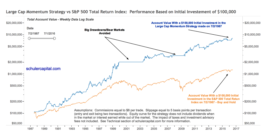
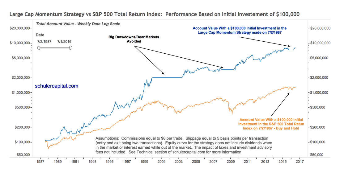
Equity Curve Chart The chart below is our Equity Curve Chart (click to enlarge). The chart shows what the total account value would have been on 7/1/2016 if a $100,000 initial investment had been made on 7/2/1987 – 29 years earlier. |
|
|
The Equity Curve chart clearly illustrates two things:
|
|
|
|
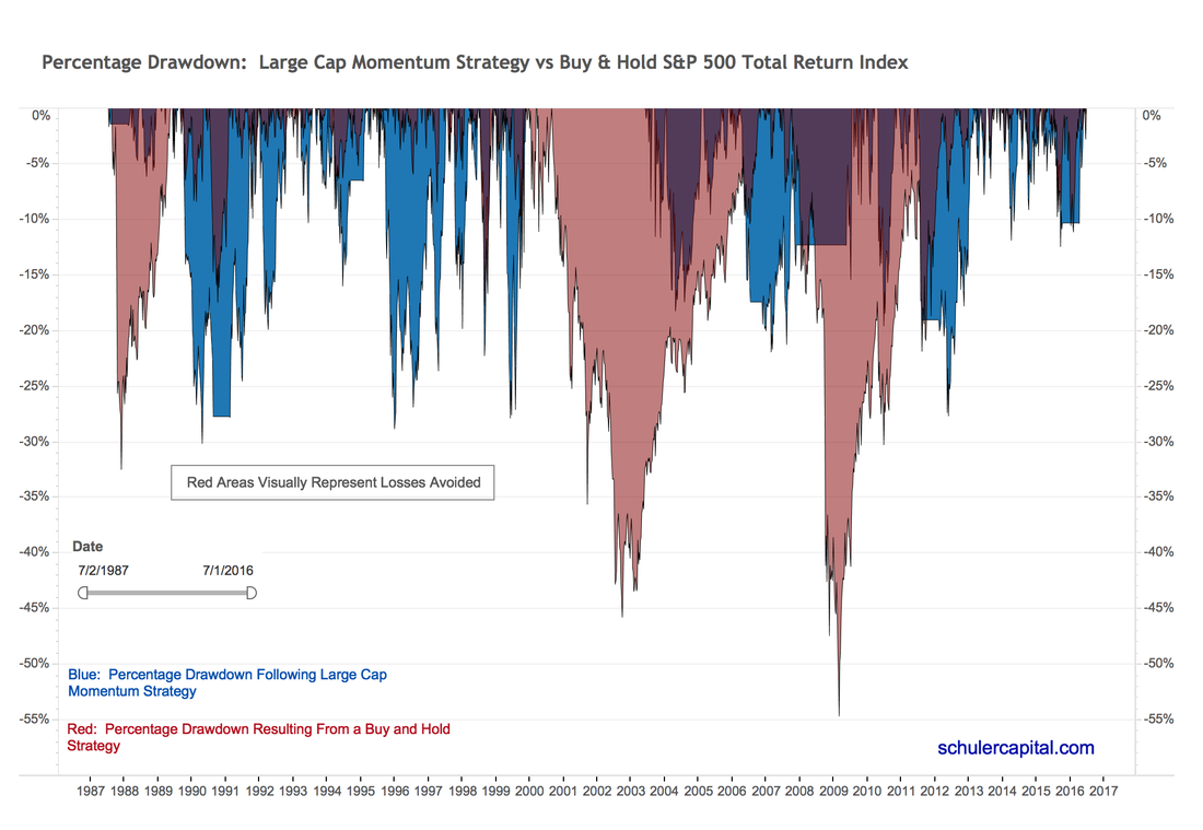
Drawdown Chart Drawdown % is defined as the total loss in percentage terms from the previous, all-time high in the account. A more detailed definition of drawdown can be found here. The red in the chart represents the losses an investor would have experienced from the previous high if s/he had invested in the S&P 500 Index and implemented a Buy & Hold strategy for 29 years. The blue in the chart shows the losses the same investor would have experienced from the previous high had s/he followed the Large Cap Momentum Strategy. |

|
|
The risk protection of the Large Cap Momentum Strategy is illustrated here. Even though as you have previously seen in the Equity Curve Chart, the Large Cap Momentum Strategy produced much higher returns than Buy & Hold, it did so with less risk! You can see that the maximum drawdown percentage occurred in March of 2009, at 54.24% for Buy & Hold. But look at what the Large Cap Momentum Strategy did. It signaled to get out of the market on 11/30/2007 and to get back into the market on 5/22/2009. The total drawdown for the 2008-2009 Great Financial Crisis would have been limited to x.xx%!. In fact, the Drawdown Chart graphically shows that, based on historical data for the entire 29-year history, the Large Cap Mo Strategy would have avoided major bear market losses. (Remember past performance is snot a guarantee of future results. See Important Information.) Performance Table
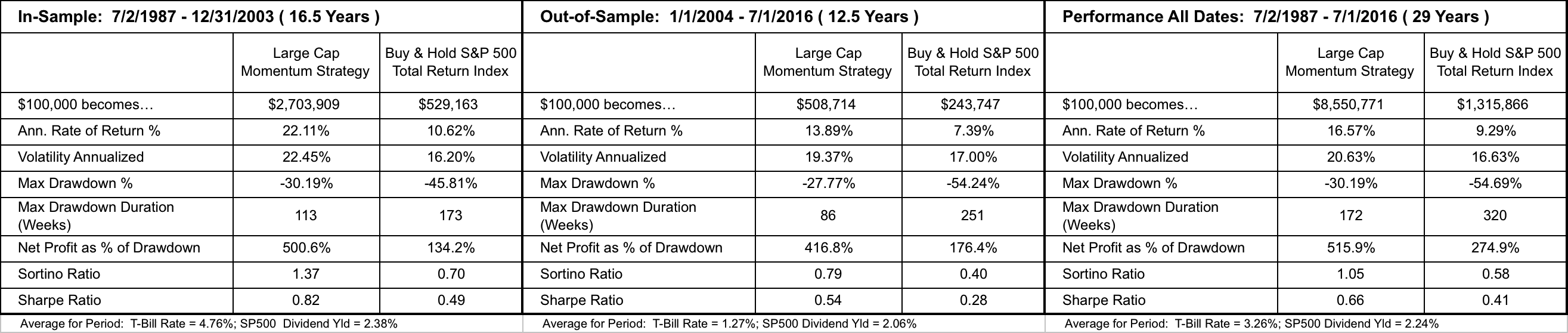
Our Performance Table is a summary of the backtesting we performed for each of our indicators, our Safeguard 1st Risk Model and our Strategies. Backtesting is simply the process of dividing your historical data into two parts: in-sample and out-of-sample. Indicators/models/strategies are developed and refined on the in-sample data and tested on the out-of-sample data. The testing on the out-of-sample data simulates actual investing with real money. The All Dates section of the Performance Table combines the results for both in-sample and out-of-sample periods. Click on the Performance Table below for a better image. |

|
|
A quick summary of the Performance Table for Large Cap Momentum: Return Measure Results
Risk Measure Results
|
|
|
|
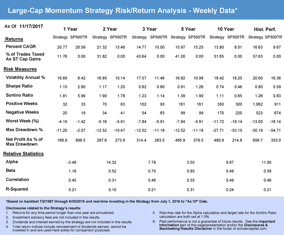
Risk/Return Analysis Table
The Risk/Return Analysis Table provides performance results for various periods, e.g. 1-year, 2-year, 3-year, 5-year, etc. prior to the "As of" date when the report was produced. In addition to the metrics in the Performance Table, some new ones appear in the Risk/Return Analysis Table:
Alpha, Beta, Correlation and R-Squared are used only for evaluating our strategies. |

|
|
|
|
In some sections of the website, we present our charts and tables in a "Gallery" to reduce their size and make it easier for you to view them. An example of this is below. Simply double click on the thumbnail to enlarge it in your web browser.
|