|
Indicators & Risk Model: Description & Development
|
|
Important Information: Performance results do not include investment advisory fees of any kind (for example, an advisory fee of 1% compounded over a 10 year period would reduce a 10% return to an 8.9% annual return). The impact of taxes on results is not included. Dividends from investments in stocks and interest from investments in short-term fixed income securities are not included in the results. Performance results shown here have not been independently audited. Estimates for slippage and commissions are included. Investing in the S&P 500 Total Return Index, or any other index, is not possible and it is used here only as a proxy for the stock market in general. Unless otherwise stated, performance results for indicators, models and strategies are hypothetical, based on backtesting using historical data, and are not a reflection of actual investment results. Past performance, whether actual or indicated by historical tests, is no guarantee of future performance or success. The risks of substantial losses are inherently part of our investment strategies and our strategies may be more volatile than the benchmark indices used for comparison. Real-time investing results presented here may differ from the results that have been or will be achieved in actual client accountsdepending on cash levels held, actual transaction costs incurred, advisory fees and taxes paid and other factors. Prospective clients should see “Important Disclosures & Backtesting Results Disclaimer” in the footer of schulercapital.com or contact us directly for more information.
|
|
Contents
|
|
What is an Indicator? An indicator, by our definition, is an objective, quantitative measure that is associated with human emotions and biases that provides signals during peaks and troughs of financial markets. Why Do Indicators Work? Our belief is that markets are driven by human emotions and crowd behavior at price extremes, in other words, at market tops and bottoms. The fact that bubbles and panics have occurred consistently over the centuries and across many geographies and cultures is evidence that fear and greed, euphoria and despair, are universal emotions that can be relied upon to repeat themselves. Because the human behavior repeats, certain measures of price, volume, divergences, breadth and monetary conditions can be assumed to be consistent with market tops and bottoms. In short, human emotions drive markets at extremes. Past human behavior will be similar to future human behavior. If we can identify indicators whose measures produce signals associated with market extremes, we will be able to identify periods in which risk is significantly higher or lower than average. John Hussman of the Hussman Funds describes the value of indicators well: |
|
“The key to drawing useful information out of noisy data is to rely on multiple “sensors.” Alone, each sensor may capture only a small portion of the true signal, and may not be greatly useful in and of itself. The power comes when the sensors are used together in order to distinguish the common signal of interest from the surrounding noise. In the financial markets, useful sensors include valuations, price action, overbought/oversold measures, breadth, leadership, sentiment, credit market behavior, volatility, economic factors, and many others.”
“I should also be clear that these signatures are not forecasts, but classifications that we’ve constructed to identify highly unusual events. The difference is that a forecast says “we expect this particular outcome in this specific instance,” while a classifier says “we identify the same signature of conditions that has regularly preceded this particular outcome in the past.” It’s a subtle distinction, but an important one. We needn't rely on forecasts. Rather, we continue to align ourselves with the prevailing evidence at each point in time, and our outlook will shift as the evidence does.” |
|
Indicators are objective and based on data. As Hussman noted above and we will explain in more detail, indicators are best used when their signals are combined into a model.
How Do You Develop a Good Indicator, Model or Strategy? Backtest to establish its effectiveness. If you haven't already done so, please read Backtesting: Description & Methodology. |
|
Our Indicators Note: A more detailed explanation of our charts and tables can be found in Using Our Charts/Tables section of this website. Double click on any chart or table to enlarge/enhance it. Momentum We use the Momentum Indicator as a measure of the overall technical condition of the market. The Momentum Indictor is a diffusion index that represents the percentage of the bullish individual trend and momentum indicators taken from each of our proprietary 95 industry groups. The trend indicators for each industry group are based on the direction of the industry’s moving averages, while the momentum indicators for each industry group are based on the rate of change of price index for each of the industry groups. The results are scored as rising or falling (1’s or 0’s) and summed into a diffusion index whose results are between 0 and 100. If the Momentum Indicator is > 75, the output is buy or 1. If <= 75, the output is sell or -1. (see chart below). These outputs, along with the outputs of the other six indicators are added together to produce the Safeguard 1st Risk Model (more on this later). |

|
The Equity Curve Chart, Drawdown Chart and Performance Table for the Momentum Indicator backtest results are below. Click to enlarge. |
|
|


|
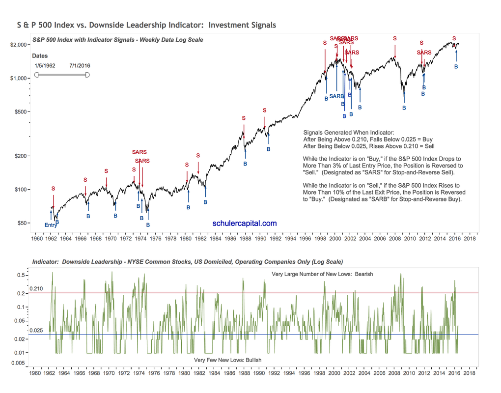
Downside Leadership Our Downside Leadership Indicator is based on the number of weekly new lows for operating-only companies traded on the NYSE. It is a classic breadth indicator: when new lows are increasing rapidly and become a major portion of the total issues traded, major sectors of the market are in decline. This negative breadth historically tends to lead the market downward, signals higher risk, and precedes bear markets. Similarly, after a bear market, when the number on new lows dries up, selling pressure has decreased, divergence fades, and stocks as a whole are on their way up for a new bull market. Our data for this indicator goes back more than 55 years! It has provided very reliable signals at important market turning points. However, false signals have occurred, consisting mainly of buy signals during bear market rallies. For this reason, a stop loss and reverse is incorporated into the Downside Leadership Indicator to make sure that it says in sync with the direction of the market. The Downside Leadership Indicator can generate a buy or a sell signal, which counts as either a 1 or a -1 for the Safeguard 1st Risk Model. |
|
|
The Equity Curve Chart, Drawdown Chart and Performance Table for the backtest results for the Downside Leadership Indicator are below. Click to enlarge. |


|
Advanced Warning Index The prices of interest-rate sensitive and consumer-discretionary stocks begin to deteriorate in the weeks and months before major market declines. We have quantified this phenomenon with a great deal of effort by identifying stocks and indices which give advanced warning that the interest rate environment and/or consumer demand may be changing for the worse. The Advanced Warning Index includes stocks and indices in Consumer Discretionary, Home Builders, Specialty Finance, Broker Dealers and Utilities industries that have demonstrated the ability to signal in advance when the broad market is about to suffer hard times. The Advanced Warning Index (AWI) is designed to forewarn investors that it is probable that a major market turning point is near. The AWI Indicator utilizes a combination of some of the longest-trading stocks, together with two financial and one utility index. Selection was based on companies that were well capitalized and which displayed a cyclical price pattern that peaked well before previous bull market tops. So what is the theory behind this indicator? In the later stages of a bull market, the Federal Reserve will tighten monetary policy as the economy starts to overheat, with the result that the interest-rate sensitive Broker Dealer, Thrift and Utilities stocks begin to weaken. At the same time, higher interest rates curb borrowing and investment spending. And as confidence about the future of the economy weakens, consumers cut back on purchases of consumer discretionary items such as houses, cars, restaurants and entertainment. Hence, these economically sensitive sectors will often signal an early warning flag prior to the start of a bear market. The Advanced Warning Index only generates sell signals and neutral signals. A sell signal counts as a – 3 and a neutral signal as a 0 for the Safeguard 1st Risk Model. |

|
The Performance Screen for the Advanced Warning Index Indicator is below. Click to enlarge. |
|
|

|
Breadth Thrusts A Breadth Thrust is signaled by an unusually high ratio of advancing stocks to declining stocks, which normally results in subsequent, above average gains in price. After some time has passed, the effect diminishes, unless another breadth thrust occurs. Breadth Thrusts have historically been important signals of new or continued market strength. Our Breadth Thrust buy signal occurs when the sum of the past 10 days of NYSE advancing issues divided by the sum of the past 10 days of NYSE declining issues exceeds 1.9. Buy signals stay on for 80 market days or 16 weeks. Repeat signals within 35 days (7 weeks) of the initial buy signal are discarded. A repeat signal that occurs after 35 days is included and the 80-day duration is reset with the count beginning again at 0. Again, our NYSE stocks only include US-based operating companies. Closed-end funds, preferred issues, structured products, ETFs, etc. are not included. Nearly 40% of the actively traded securities on the NYSE are not common stocks or domestically domiciled operating companies. When a Breadth Thrust buy signal is on, it scores a 1 for the Safeguard 1st Risk Model. In all other cases, it scores a 0 for neutral. |

|
The Performance Screen for the Breadth Thrusts Indicator is below. Click to enlarge. |
|
|

|
$Volume Supply and Demand The stock market, like any other product, commodity or service is subject to supply and demand. In its simplest form the more demand for stocks, the higher the price, and the more supply, the lower the price. Fluctuations in the supply and demand for stocks tend to move in waves or trends according to economic conditions and the emotions of the participants at extremes. The number of shares traded (volume) is the key to quantifying the amount of supply and demand. For example, if the volume is much higher than normal on a day when the market declines significantly, one could surmise that selling, and therefore supply, was more than normal; contrariwise, with high volume and a large gain, demand was more than normal. In other words, if sellers wish to take out more money in aggregate than buyers wish to invest, prices decline. If buyers wish to invest more money than sellers are trying to take out, stock prices will rise to levels where sellers are again attracted. Simple enough! We quantify the supply and demand for stocks daily in the following manner. Each day, for each stock in our universe we calculate the dollar-volume ($volume), which is the stock's price times its volume for that day. If the stock's price went up, then its dollar- volume is positive. If its price went down, then its dollar volume is negative. If a stock is unchanged, it is not included in the analysis. We then sum the dollar-volume for all the stocks which yields the result for that day. We smooth the daily results over several months in order to identify trends more clearly. The percent of summed supply $volume plus the percent of demand $volume always adds up to 100. Our indicator is simply the percent of demand $volume minus the percentage of supply $volume. The $Volume Supply Demand Indicator generates a buy or a sell signal, which counts as either a 1 or a -1 for the Safeguard 1st Risk Model. |

|
The Equity Curve Chart, Drawdown Chart and Performance Table for the backtest result for the $Volume Supply Demand Indicator are below. Click to enlarge. |
|
|


|
Moody’s Baa Yield 26 Week % Change The Moody’s Baa Indicator is based on the percentage change in the interest rate of the Moody’s Baa rated bonds, which are at the bottom of the Investment Grade rating. Moody's Baa bonds are sensitive mainly to the interest rate environment of the bond market as a whole and the expected actions of the Federal Reserve, but also to some degree to the conditions affecting the equity markets. Generally, if interest rates are heading up (the indicator is high and rising), it’s bad for stocks. The opposite is the case if interest rates are falling (the indicator is low and falling), which is good for stocks. When we were optimizing this indicator using the in-sample data we noticed that in certain instances, like the 2000-2003 bear market the indicator did not work. Our theory is that, after an initial bearish signal, on certain occasions interest rates may be falling because “things are so bad” which is not positive for stocks. On the opposite end of the spectrum, interest rates may be rising because “things are so good” which is good for stocks. For these reasons, we implemented a stop loss and reverse into the indicator strategy to ensure that the indicator is not on the wrong side of the market for an extended period of time. The Moody’s Baa Yield 26 Week % Change Indicator generates a 1 for a buy signal and a -1 for a sell signal for the Safeguard 1st Risk Model. |

|
The Equity Curve Chart, Drawdown Chart and Performance Table for the backtest results for the Moody's Baa 26 Week % Change Indicator are below. Click to enlarge. |
|
|


|
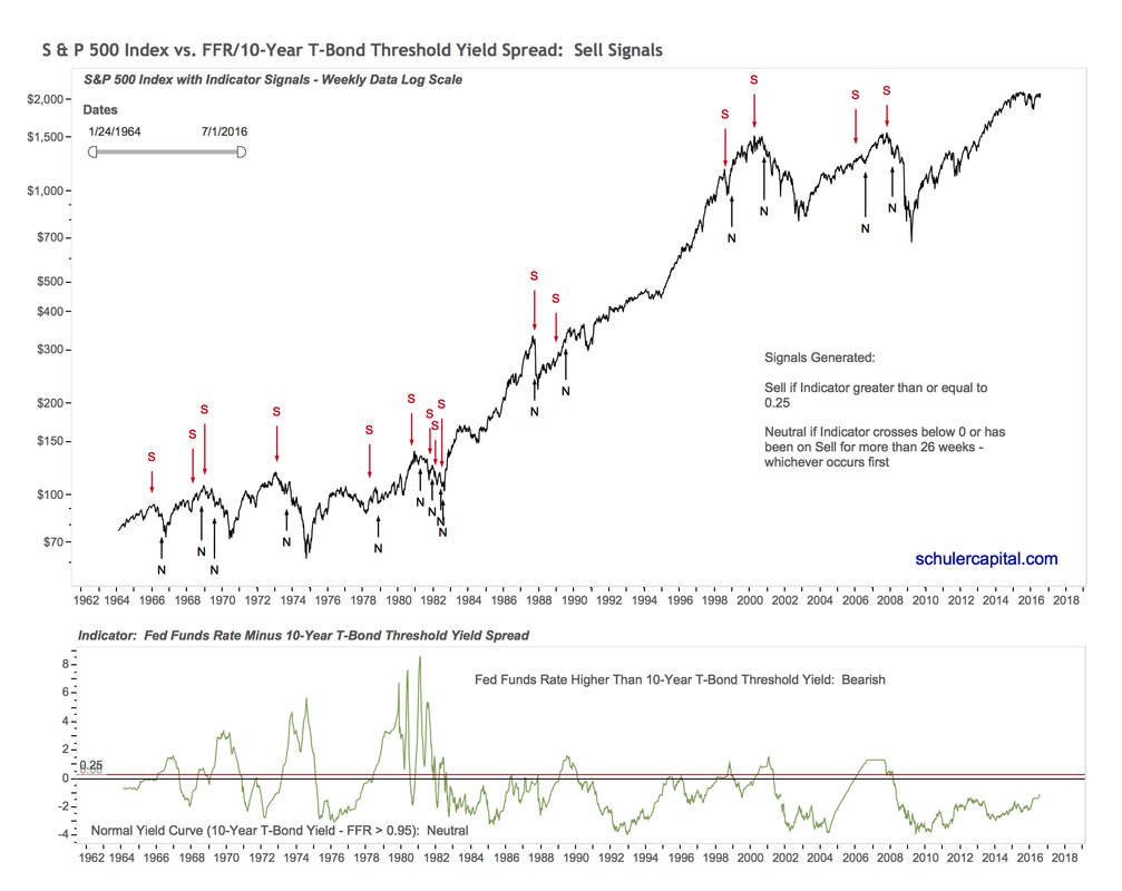
FFR to 10Yr T-Bond Threshold Yield Spread An inverted yield curve has one of the best track records for predicting recessions and bear markets. We initially planned to use the yield spread between the 10-year Treasury Bond and the 3-month Treasury Bill as an indicator to signal when stocks might be susceptible to tightening of monetary conditions by the Fed. While the Yield Spread based on the 3-month Treasury Bill and the 10-year Treasury Bond has been a very reliable indicator for the period since the 1960s, we are currently in an unprecedented monetary environment that includes Quantitative Easing and a massive growth in the Feds balance sheet designed to combat deflation. Most of the research done on the yield curve has involved only data since 1962 when Fed policies were mainly focused on combatting inflation. We discovered a research study done by Well Fargo Securities Economic Group, whose economists, being worried about the same issue, decided to include data from the 1950s, a more deflationary monetary environment, in the efforts to develop a better yield-curve based indicator, which they called the FFR (Federal Funds Rate) to 10-Year Threshold. Technical Description (Skip this if you are not interested in technical details) At the highest level our indicator is founded on the concept of Wells Fargo’s research and is calculated based on the difference between the Fed Funds Rate and 10-year Treasury Yield Threshold. But what is the 10-year Treasury Threshold? The 10-year Treasury Threshold is determined in one of two ways depending on what the Fed is doing: 1) if the Fed has initiated a period of a rising Fed Funds Rate, then the 10-year Treasury Threshold becomes the lowest level (low watermark) of the 10-year Treasury Note yield reached during the raising cycle, calculated on an on-going basis or 2) if the Fed is in a period of cutting the Fed Funds Rate, then the 10-year Treasury Threshold is simply the 10-year Treasury Note yield at the time. When the Fed Funds Rate rises 25 basis points (0.25%) above the 10-year Treasury Threshold, as determined above, a sell signal is generated. A concrete example best illustrates how this works. The last Fed interest-rate raising cycle started with a 0.25% increase in the Fed Funds Rate on December 18, 2015. Thereafter, on July 8, 2016, the yield on the 10-year Treasury Note hit its lowest point (also called its low watermark), 1.37%. This 1.37% yield low point became the 10-year Treasury Threshold, or the point of comparison for our indicator. The Fed continued to raise the Fed Funds Rate and on April 27, 2018, it crossed more than 0.25% above the 10-year Threshold of 1.37% established by the 10-year Treasury Note for that rate-raising cycle. At this point the FFR/10-year Threshold Yield Spread generated a sell signal. During a Fed Funds Rate rising-rate cycle, the indicator’s sell signal lasts for 26 weeks and becomes neutral after that. A sell signal also switches to neutral, if, after the Fed Funds Rate interest-rate raising cycle has ended (it has begun to cut the Fed Funds Rate), the 10-year Treasury Note yield exceeds the Fed Funds Rate. Bottom Line Our FFR/10-year Treasury Threshold Indicator has predicted all recessions since 1955 with an average lead time of 17 months. Of course, our goal is not to predict recessions, but rather to identify times when it is highly risky to be in the markets – in other words periods immediately preceding bear markets. Given that historically most bear markets have started any where between three months and 18 months prior to recessions, this indicator has been proven to be extremely useful historically. The FFR/10-year Treasury Threshold Indicator is more useful than traditional yield curve/yield spread indicators for the following reasons:
For our Safeguard 1st Risk Model, a sell signal counts as a -1 and a neutral signal 0. The chart below shows 34 years of the history of the indicator and its signals. |
|
|
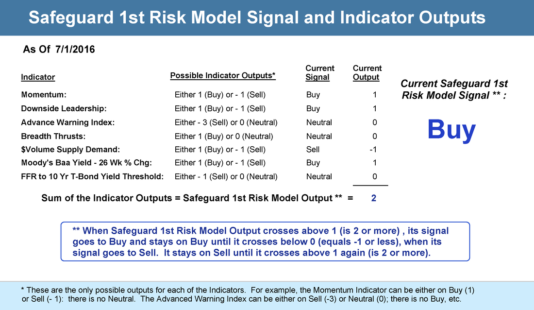
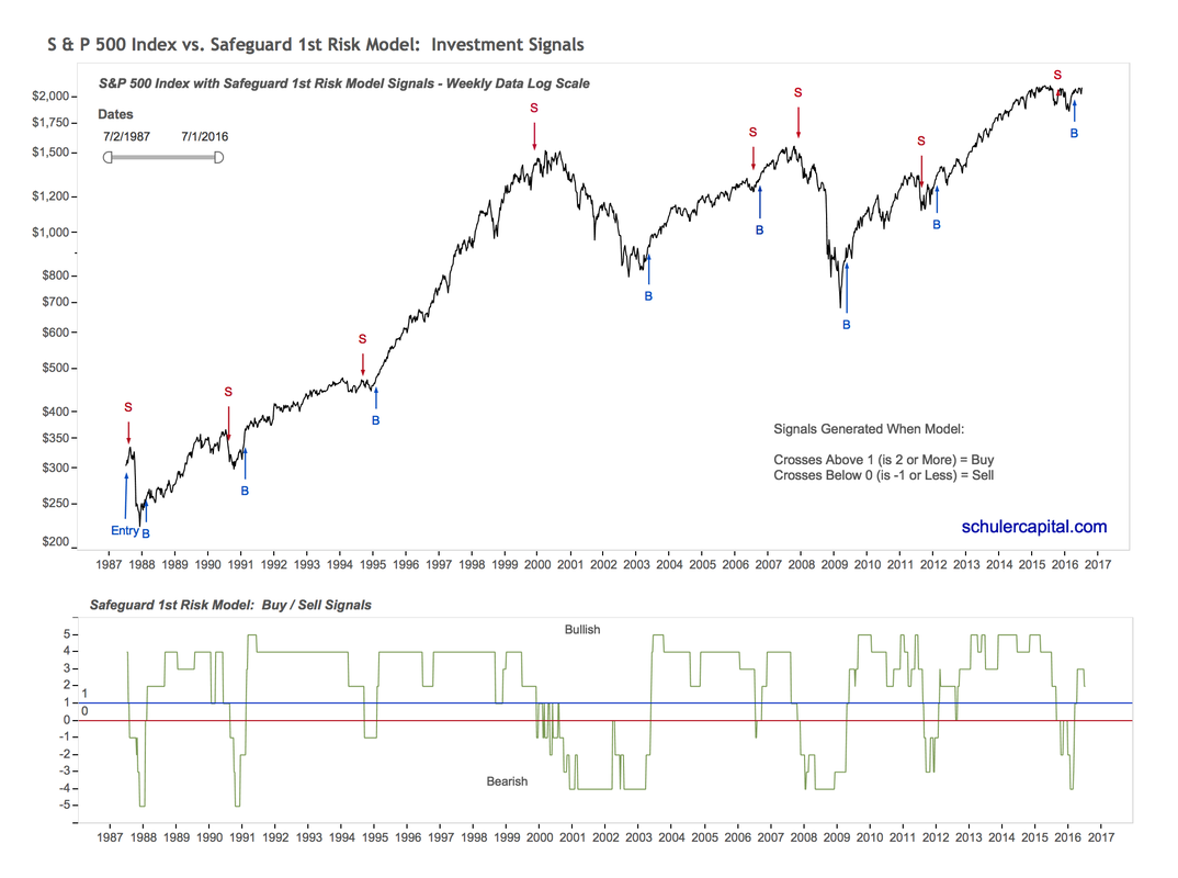
How Our Indicators Are Combined to Create the Safeguard 1st Risk Model We use the table below to update the status of the outputs of our indicators and the final "score" and signal for the Safeguard 1st Risk Model. The graph which follows the table visually shows the output of the risk model (see the green line in the lower panel) and the buy and sell signals (the arrows in the upper half of the graph).
|
|
The Equity Curve Chart, Drawdown Chart and Performance Table for the backtest results for the Safeguard 1st Risk Model are below. Click to enlarge.


